Friday 7 October 2011

Analysis of The Haunting Poster


 Worksheet Analysis of Film Poster

Film Poster
Name & genre of film


Name- The Haunting
Genre- Horror 
Key image (camera shot/angle – purpose); expressions, posture/body language. How do they reinforce the genre?


The camera shot of the main image is an extreme long shot of the house and the angle it is at eye level. The purpose of this is so the audience see the entire house and the landscape around it. Also it allows the audience to see the lights that look two eyes, this is so the audience can look straight into them and feel like someone is looking at them back. This reinforces the genre because houses don’t have eyes yet this one gives the illusion that it has and that it’s watching you. 
Lighting & how it influences the meaning of the text & genre.


The lighting of the image is low key and gloomy this creates a terrifying atmosphere for the audience and this reinforces the typical conventions of a horror film. 
Costumes/dress codes; icons/props, make-up – how do the challenge or reinforce the generic conventions.

On this film poster there are no costumes because the image is of the house.
Background, colour
( connotations) & layout & how they influence meaning.


The background of the image is part of the main image which is dark gloomy clouds surrounding the castle this connotes that the house is in the middle of the woods, this is usually where horror films are set so this reinforces the genre.  
Copy (text) – Size, font style, colour & content (title/tagline/credits/ratings etc)


The title of the film is the biggest text on the screen, it is white and in a ghostly font. This suggests that the film is to do with the supernatural. The colour white connotes that innocence but in this sense it connotes ghosts. The tagline is above the title and smaller because it is not the most important text on the page, this is a grey which connotes the gloominess and the darkness of the house. The release date is a similar size to the tagline, but the colour is red. This connotes blood and violence. On the very top of the poster it gives tells you who the director is and previous movies he has done, this is also in red and connotes that the director has put violence and the supernatural in the film.
Target audience

The target audience is from the ages 12- 18, with an interest in horror films and the supernatural. It is aimed at all races because on the poster there is no character’s so therefore aimed at all.
Representation of Characters – Age, race gender, Culture, sexuality etc. Do they challenge or reinforce the genre conventions.

There are no characters on the image because it just shows the spooky house this is so that the audience get to meet the characters when watching the film.
Institutional- Product details (credits, cast, director/producer/studios/certification/web address etc).

The director was Jan de Bont, the studios were DreamWorks, the certificate was 12 and the web address was www.dreamworks.com/Haunting.
Enigma/Narrative image (How does the poster create a ‘story’ & entice its intended audience to go see the film?) What questions does the poster ‘ask’ of the audience?


The narrative the poster creates is that the house is haunted and evil because the tagline say ‘some houses are born bad’, we also get this impression from the two light pools in the middle of the poster that look like eyes staring at you. The use of red suggests that people will visit the house and some will die violent deaths. The poster entices its audience by not putting the characters on the poster so that you have to watch the film to find out who they are. Another way it entices is the audience is by not giving too much away for example it doesn’t show you what is haunting them just the impression its supernatural. This will make the audience want to see it more to unravel the secrets.

Film Magazine Cover Analysis

Friday 30 September 2011

Creep Analysis

Creep Analysis

SETTINGS (the frightening place):
  • The film is set in an underground station using familiar station such as Charing Cross – underground stations may not be considered to be safe but they are familiar and used in the war as a shelter, this way they can be considered to be safe. The underground is a transient location no one remains there for any length of time but in this film Kate is trapped – the familiar location becomes a dangerous one to be in – this first becomes clear when she attempts to leave the station but is met by a closed gate – she is now trapped
  • The killer’s lair seems like a place where he keeps his human ‘pets’
  • The operating room – disturbing as they are supposed to be sterile, clean environment this one clearly is not, this can make the audience feel uncomfortable. Along with this we have the unsettling images of babies in large test tubes.
CHARACTERS (final girl/ villain/ monster/ killer):
  • ‘Kate’ is the female lead, a false killer is set up through Guy who is on the tube with Kate and sexually attacks her the audience are left to think whether he was the one who was watching her
  • The killer is not seen until 45mins into the film and it not made obvious as to if the killer is human or not although the film does seems to want to make the audience think its creature rather than man.
  • When we do see his face his nose is disfigured, he has no eyebrows (which always seems to make the human face look slightly odd); he has scars on his face and also blood (body is slightly deformed too)
  • If it wasn’t clear before in the operating room it becomes clear that the killer is psychotic washing his hands with no running water, etc, as he is about to perform an operation on his female victim.
  • As Kate runs the killer coolly stalks her
  • The killer ‘Craig’ is in the end killed by Kate she uses all of her strength to rip a metal chain out of the wall (she saves the day) having appeared to be a ‘bitch’ at the start of the film she is now the hero and everyone else is dead – and now she looks like a homeless person – the irony!  
ICONOGRAPHY:
  • The start of the film uses blood it can be view on the floor (see sound)
  • Other images strongly related to the horror genre are not seen until the killer is revealed to the audience, we are witness to him pounding the chest of one of his victims with a grotesquely bloody outcome, he takes out a body part and appears to feed it to the rats


CAMERA WORK:
  • Close up of a bloody woman’s face (she comes out of the dark) and the film quickly cuts to a party leaving the audience to think what happened?
  • POV shot used to see Kate as she is looking for an exit the assumption being that she is being watched (but by whom or what?)
  • Close up used on the peep hole of the driver door – and then a reverse shot to see a close up of the drivers bloody face with some kind of surgical implement on his face (For Kate a case of look but can’t see)
  • As Kate runs through the tube the camera is used in 3 positions  (all hand  held) behind her, in front, POV
  • Interesting shot used as she is running from the tube and through the station it appears as if the camera is running towards her, she stops and we see as close up of her face – connotations – no where to run/ being stuck this through is furthered as the camera circles around her
  • She desperately thinks which direction she should go in
  • The shot from the top of the escalators can be said to be very poignant they look so steep from the high angle and they appear to be a long way down – once you descend you are not likely to come back up!
  • Use of CCTV shot used after Mandy is captured – showing that they are of no use – or the person in control of them is not doing their job
LIGHTING:
  • Use of lighting in the tunnel in the start of the film is limited to the torch light – this encourages the audience to look elsewhere within the mise-en-scene (away from the two characters) in search of what may be lurking in the shadows.
  • Use of dramatic irony a shadow of ‘something’ is seen so the audience know that ‘something/ someone’ is there but the character isn’t aware that he is not alone
  • Torchlight and shadow used again when the lights go off on the tube – the torchlight is used to hide the identity of the person holding it, it’s so bright that Kate is unable to identify the person holding it. She believes it is the driver but the audience know different
  • When Kate finds a door and enters she uses just the flame of a lighter to guide her in the darkness – connotations much the same as the torchlight
  • Use of torchlight again in storeroom. Kate turns it off and then on again but this time we see the killers face for the first time (this would make the audience jump)
SOUND:
  • Along with this can be heard the subdued screams of a female this along with the blood would mean danger.
  • Use of sound to create premature terror – the audience know that it is horror and so are awaiting the moment that will make them jump – but some moments are put there just to keep them on their toes e.g. when the workmen are clearing rubbish from the tunnel
  • As one of the workmen head down a tunnel alone a menacing soundtrack begins indicating that he may be heading for danger, also fitting with convention that one character goes off alone something is bound to happen
  • Music used to signify danger and aid the narrative rather than take it over or lead it.
  • First attack (Guy) we see him dragged from the tube but the accompanying sound is far more potent the use of diagetic sound but no use of images to show what is happening to Guy this allows the audience to use their own imagination –the power of suggestion is at play
  • As Kate runs from the tube the sound is reminiscent of a heartbeat but as it would sound if you were inside of someone’s body – is it Kate’s heart we hear?
  • Sound of babies used when the preserved ones are seen on screen, this adds to the unsettling images, and creates a terror within the audience

EXTRA NOTES:
  • The opening credits move on the screen mimicking the movement of a tube train.
  • Clearly British first clue the use of accents.
  • When a tube arrives at the station Kate believes that she may be able to get out – but the audience know different as we are shown that another ‘body’ also gets on to the tube
  • Rats are pest/ vermin and can carry diseases the use of hem in the film signifies some kind of danger (possibly used in the same way that vultures are used in other films only present when death is imminent)
  • The sound of the killer performing his ‘operation’ along with the image of blood spraying in his face, would be a scene that the female audience with empathize with due to the fact that he has inserted the bloody, rusty knife into Mandy’s vagina (slightly perverse – possibly effects theory can be applied) in a way only the women can really relate to the pain that is being inflicted on this body

Friday 23 September 2011

Second Poster Analysis

Poster Analysis

Secondary research- review of horror film paranormal activity 2

Paranormal Activity 2 is a second film that manages to take what made the first film interesting, and expand and intensify it. The constant cycling through the video camera shots every night with nothing happening for the most part is both reassuring and unnerving at the same time. You know eventually you’ll see SOMETHING happen in one of those shots every time the cycle starts – and you get to a point where you’re feeling a combination of being a bit bored… but relieved that nothing happened.
For me, the very things that people didn’t like about the first one (and might not like about this one) are things that are a plus: The use of suspense and dread instead of gore and cheap jump scares (there’s not a cat to jump into the shot and screech anywhere to be seen). The fact that it’s actually scarier to imagine what might be behind a door than to actually be shown it. The lack of manipulative music, “cool” editing techniques, etc. The reality-based look and approach to the whole thing just makes it hit that much closer to home – and when I say “home” I mean it. Late at night, alone, only one light on. This movie, like the first one, sticks with you in those late moments just before you get ready to turn in.
Director Tod Williams and writer Michael R. Perry (with input from Oren Peli, the fellow who wrote, directed and produced the first one) had a heck of a job ahead of them trying to do a follow up to a seemingly one-shot film like Paranormal Activity – but I think they did a fine job of it. The actors are believable and there are actually quite a few moments of laugh out loud humor from the dad/husband, who plays a bit of the comedian in his family (reminded me of myself in that regard).
As with the first, I’m confused at the decision to go for the R rating here. It’s mainly for language, which could have been easily eliminated. I’m not a big fan of PG-13 horror movies or slimming down an R to squeak under the PG-13 bar, but in a film like this where it’s all atmosphere and suspense (with some violence, yes) it seems like they made have made more money by not going the R route. Maybe they were shooting for that R rating horror movie “street cred?”
There are probably a good half-dozen real scares in the movie, and if I have one complaint it’s that overall it feels like an interesting journey that doesn’t end up anywhere… interesting. Most of the film goes by before it really kicks into gear, and then it’s over pretty quickly. If we were on a 10 scale here I’d probably have gone 7.5/10.
In the end, it delivers dread, makes you nervous and scares you, and what more can you ask from a horror movie? Too bad that it really leaves you wanting more when the credits start to roll.

Tuesday 20 September 2011

Comparative Essay

Comparing the changes in the horror genre of Halloween and Scream


After the film Halloween the horror was genre was fading from our screen there were many reasons for this. One reason was because many directors has copied the conventions of Halloween so it became too repetitive. Also it was becoming unrealistic because it didn’t relate to real life and therefore wouldn’t do what horrors are meant to which is scare people. Another reason was the violence in the film influenced the children to think that being violent was good and also in the film there were no parents around it meant that the violence went unpunished, so it also encouraged children to do it when their parents went out. The violence was largely aimed at men and became sexist towards women who kept being killed; this meant it excluded a large part of society. The last reason why horror was fading is because the violence didn’t add anything to the film it was just there so it had no purpose. This put many people off watching them because they already knew how it would it end before the film had even begun.

This all changed when Wes Craven directed the film Scream. He was keen to change the old conventions used in previous horror films. The first way he did this was by avoiding the clichés like not using a steadicam for most of the film which Halloween did, it has fast moving camerawork and editing, this meant that the audience would see something new. Through out the movie the characters kept constantly mocking the conventions used in Halloween and previous horror films for example when one of the characters says ‘don’t say I’ll be right back’ and ‘for once I am thankful for being a virgin’. This shows they are mocking because in previous horror films when you say I’ll be right back they didn’t come back and that the reason the boy survived was because he was a virgin, but in previous horror films when the victims have sex they die afterwards. Also he keeps referring to previous horror films such as Halloween and Nightmare on
Elm Street
by using quiz’s, questions and jokes. This use of parody highlights the old clichés of horror and mocks them so the audience are made aware that they are outworn conventions

In Halloween the music was monotonous and too obvious where as in Scream the music was atmospheric and had an unrecognisable tune which varied for different scenes. The music in Scream was also carefully timed and constructed in synchronisation with the action, so this built up the tension in the audience putting them on the edge of their seats waiting for something to happen where as in Halloween it was obvious when something sinister was about to happen.

Scream has a big budget with a sophisticated, high tech soundtrack and used a number of big name stars, they included Neve Campbell (Sydney), Courtney Cox (reporter) and Drew Barrymore (1st Victim). This was unusual for Horror films to use such big stars, where as in Halloween it had a very low budget, unknown actors, everyday suburban locations, boring, and obvious soundtrack with no special effects. This meant that Scream attracted more attention because the audience recognised the actors in the film. While promoting Scream the posters used Drew Barrymore this made the audience think she would survive but this was untrue she was the first victim in the film and was murdered right at the start of the film. This was unusual for a big star to die so early on so for the audience they did not know what to expect from the rest of film which would excite and frighten them. This created and enigma as the audience were made unaware of what may happen in the film.

In Scream there is less voyeurism (observing from a secret vantage point of naked bodies or sexual acts of others), which means the audience sees things from both the killers and victims point of view.  Which means the audience would have more sympathy for the victims because they are not as stupid as they in Halloween. In Scream the victims fight back and inflict injuries on the killers, so it’s more of an equal fight. This challenges the conventions because in Halloween the victims are weak and useless. Also in Scream there are two killers and because they use a phone call to stalk the victims it mans they could be omnipresent (anywhere) which makes it more frightening because you never know when or where the killer will jump out. Another challenge of the stereotype is that the killers aren’t superhuman or robotic like in previous films; they are ordinary boys form the community which adds realism to the film.

The similarities that Scream has to Halloween are that they both use knives to kill their victims which is an icon in any horror film, this allows scream to still represent the horror genre. Also they both use masks to cover the killers face, but in scream it’s a whole costume, but Wes Craven reinvented the mask of Halloween. This also connects Scream to the horror genre because it uses some of the traditional conventions.

In conclusion Scream moves away from the typical conventions and goes in a new direction creating new conventions for the horror genre. But it still uses some traditional conventions so the audience can relate to previous horror films like Halloween which uses all the traditional conventions for example using the iconic knife for the killings. I think Wes Craven has allowed other directors to be more creative and expand the conventions, giving audiences all different types of horror, this has made horror reappear and make a comeback with new less predictable themes.

Friday 16 September 2011

Front Cover for Media Coursework

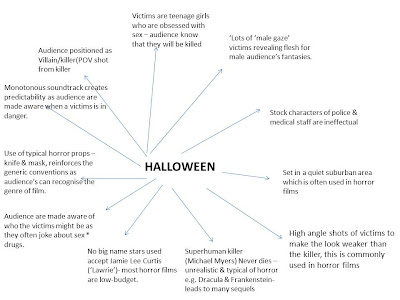
key features of Halloween

Brief

A promotional package for a new Horror film, to include a teaser trailer (maximum 60 seconds), together with a film magazine front cover, featuring the film. Also to produce a promotional poster of the film. All images and soundtrack to be original